
Mistakes to Avoid
By being aware of these mistakes, you can take steps to avoid them and ensure that your project is printed correctly the first time around.

According to Mr. Murphy, "things that CAN go wrong.WILL go Wrong" - These are some of the things you can do (or NOT do) to prevent suprises and ensure your print project is perfectly executed, meeting your expectations.
Ambiguous Specs
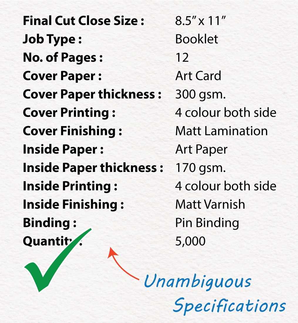
Ambiguous Specs
Having precise and unambiguous specifications is essential for a project's success. It ensures that there is no confusion, allows for accurate comparison of options, and eliminates any doubts about receiving what was requested. We strive to work closely with our clients acting as partners and consultants to help them navigate through the various options available. We have an excellent online form that makes the process easier for our clients.
Ink Coverage
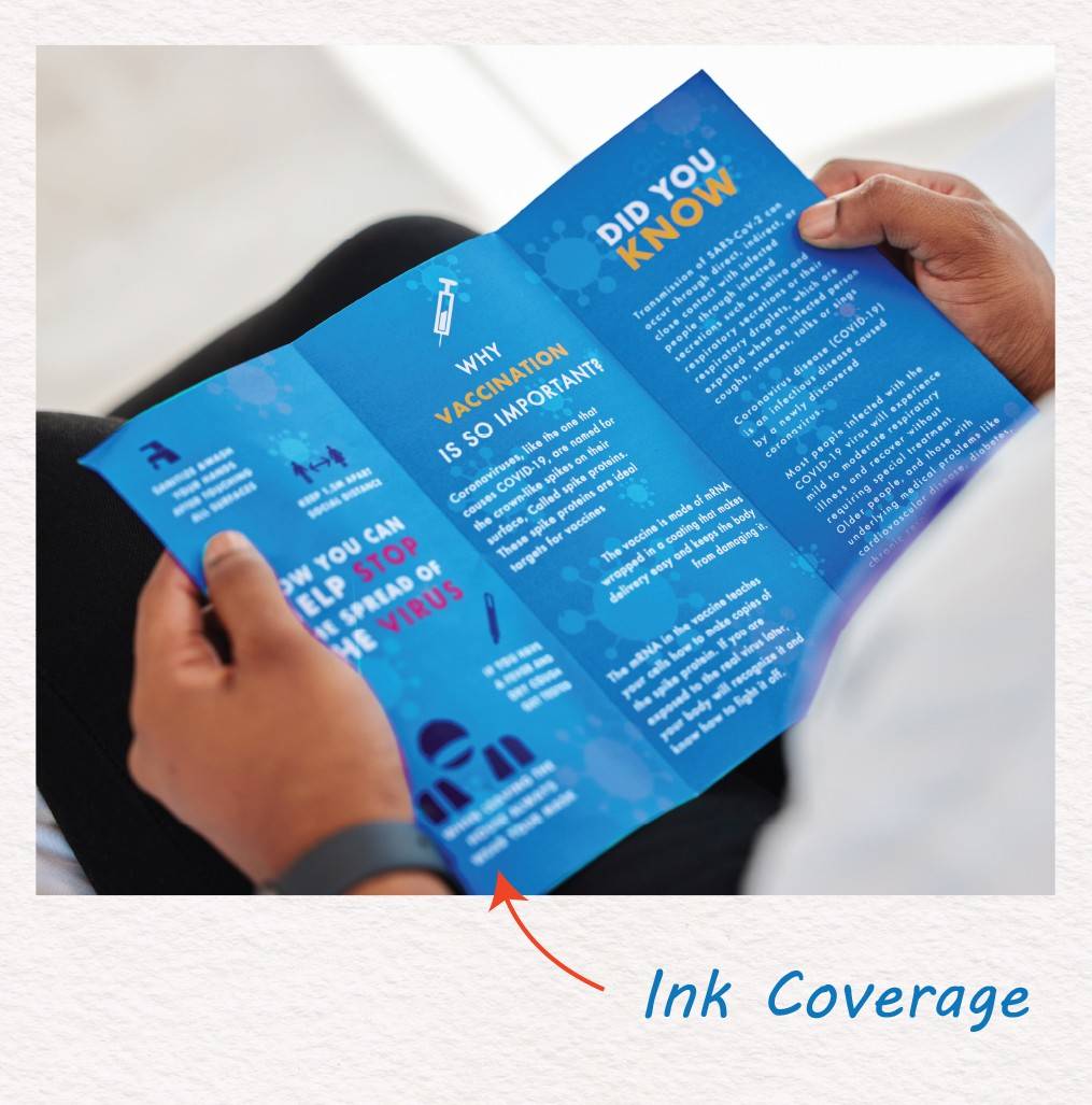
Ink Coverage
The choice of paper and ink quantity significantly affects print appearance. Heavy ink on glossy paper or exceeding ink limits for different papers (e.g., 240 for uncoated lightweight, 280-300 for heavier) harms quality. Excessive ink invites scuffs, especially on uncoated sheets. Insufficient drying between colors or after printing leads to defects, requiring more drying time. We help you avoid over-inking and provide info for ideal paper-ink combo.
No Bleed
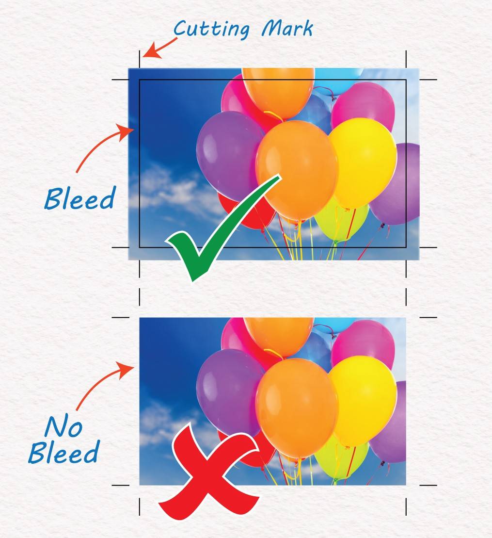
No Bleed
Bleed is crucial in print design to avoid white spaces or trimming errors. It is when images extend beyond the page borders, preventing any unwanted white areas in the final print. Without bleed, even a small white space can make the design look unprofessional. To avoid this, use a template with ¹/₈ inch (.125'' / 3mm) bleed and ensure all elements reach the bleed areas edge for a clean final product after trimming.
Low Resolution Image
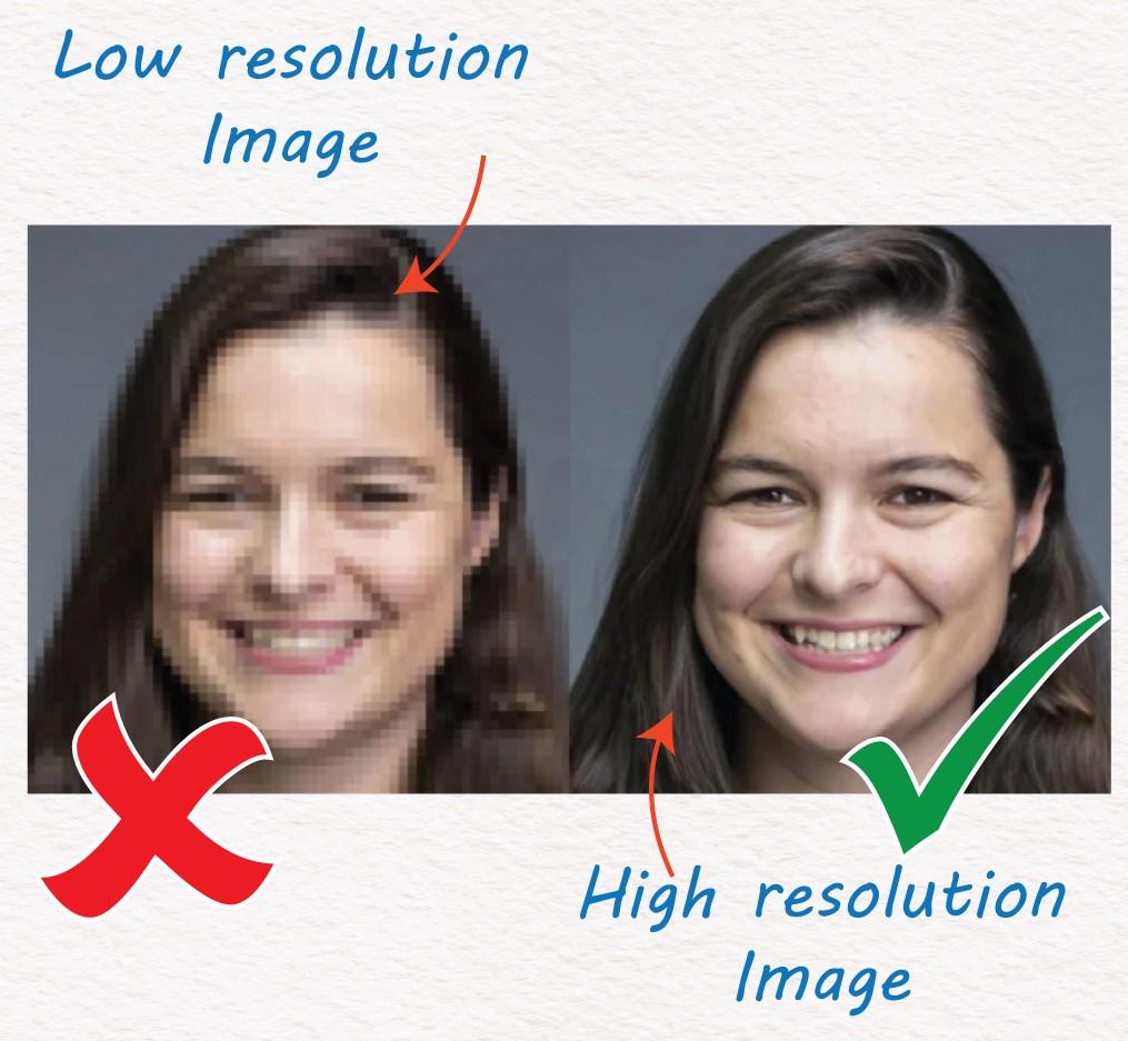
Low Resolution Image
Using low-resolution images can harm the quality of your printed materials. While it may be tempting to grab an image from a website, most of these images are only 72 DPI, which is not suitable for printing on high-end presses that require 300 DPI resolution. This can result in pixelated and generally poor-looking documents.
It is important to always use high-quality, licensed images with a resolution of 300 DPI for most applications, such as A4 or US Letter sizes. For larger posters or banners, 200 DPI is recommended, while 150 DPI is suitable for signage. If there are no alternatives to low-resolution images.
You can always talk to us and we will find a solution to make it work.
Four-colour Text
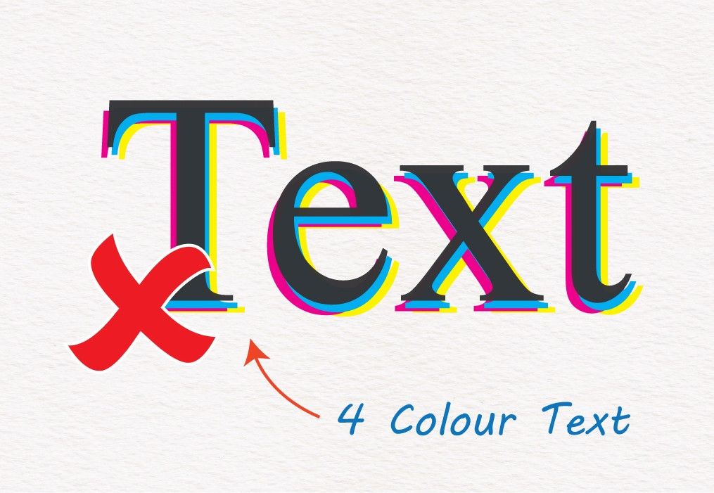
Four-colour Text
Due to the dynamic nature of high-end printing presses, there is always the risk that one or more of the 4 process colours (Cyan, Magenta, Yellow, and Black) will not align with the others, resulting in a misregistration or shift. This causes text made up of multiple colours to look unsharp, often with a “rainbow effect”.
This can be mitigated by using Black-ink-only (or single-colour) text.
Knockout Text
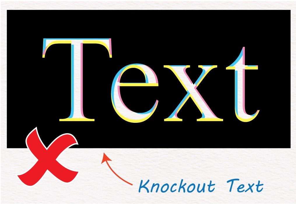
Knockout Text
Similar to the aforementioned issue, knockout text also carries the risk of misalignment or shift among the four process colours (Cyan, Magenta, Yellow, and Black). This can lead to the text appearing unsharp with a "rainbow effect" & particularly for smaller font sizes where the text can fill in and become difficult to read.
To prevent this, it's recommended to limit the use of knockout text to 8-point font size (or slightly larger than regular text) and to use black-only ink. This can help mitigate any potential misregistration or shifting issues that may occur during the printing process.
Edgey Text
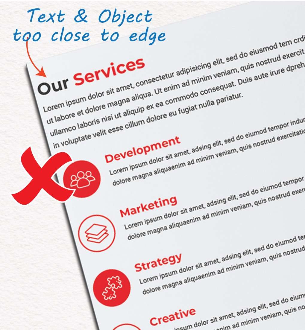
Edgey Text
Just as personal space is important in life, it is also important in printed materials. It is crucial to give your text enough room to “breathe” and convey your message effectively. Placing text too close to the edges or other graphic elements can make it look rushed, poorly designed, and hard to read for the intended audience.
To avoid this problem, make sure to give your text adequate personal space by leaving a safety margin of at least ¼ inch (.25'') around your document. This margin should be free of any text or graphic elements to ensure that your message is clear and easy to read.
Binding & Space Issues
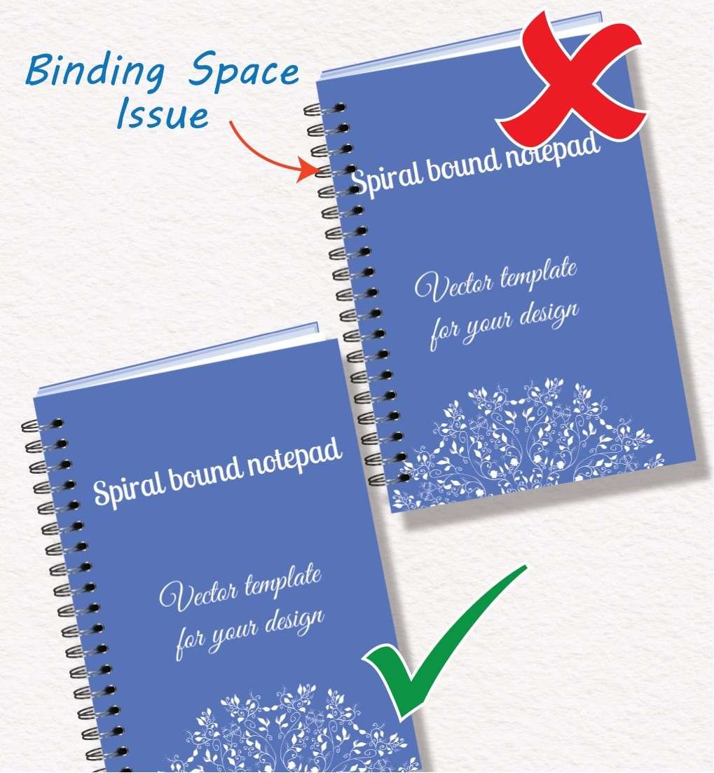
Binding & Space Issues
If you plan to change the binding style of your document, keep in mind that different styles may require different safety margins. For example, wire-o binding, which is commonly used for training manuals and presentations, involves punching holes on one side of the document and threading a double metal wire spiral through them. Not providing enough safety margin on this side can result in important text or content being compromised or unreadable. To avoid this issue, it is recommended to leave a generous 10-15 mm (³/₈ to ⁵/₈ inch) margin from the binding edge, depending on the number of pages and size of the spiral.
We can assist you in planning your booklet for any binding style and ensure a successful outcome.
Crossover Images
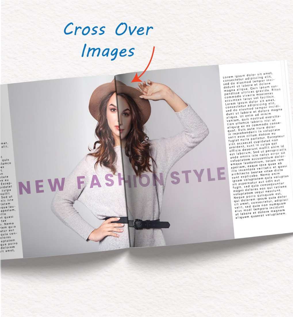
Crossover Images
Large images that span multiple pages in a document can be visually stunning, but if they don’t align perfectly, they can look “off” and diminish the impact of the image. Even small shifts can be noticeable to the human eye, and this is amplified in the brain. To avoid this, try to use crossover images only on same-sheet pages or folded sheets like tri-folds.
If this is not possible, it is important to work with an experienced printer to ensure that your designs are not distorted. One Step Print can help with this.